
In the context of Six Sigma, the Pareto Chart is a member of the 7 QC Tools and is a valuable tool for the Measure phase of the DMAIC process. The Pareto Chart is named after Vilfredo Pareto, a 19th-century economist; who postulated that a large share of wealth is owned by a small percentage of the population. This basic principle translates well into quality problems and is a point of discussion in Lean Six Sigma courses. Pareto analysis is the process of ranking opportunities to determine which of the many potential opportunities should be pursued first. It is also known by Six Sigma Certified Green Belts as ‘‘separating the vital few from the trivial many.’’
Attend our 100% Online & Self-Paced Free Six Sigma Training.

What is a Pareto Chart?
A Pareto Chart, according to the Lean training course, is a series of bars whose heights reflect the frequency or impact of problems. The bars are arranged in descending order of height from left to right. This means the categories outlined by the tall bars on the left are relatively more vital than those on the right. This bar chart is used to separate the “vital few” from the “trivial many”.
80:20 Rule
The Pareto chart is used to prioritize the contributors which make the biggest impact on a problem, or which represents the largest areas of opportunity. These diagrams communicate the principle of 80:20. It states that 80% of an effect comes from 20% of the causes. For example:
- 80% of the revenue comes from 20% of the customers;
- Or 80% of the customers contribute only 20% of the revenue.
- 80% of the customer complaints come from only these few causes (20%)
- 80% of the repair and maintenance time is spent on these few problematic areas (20%).
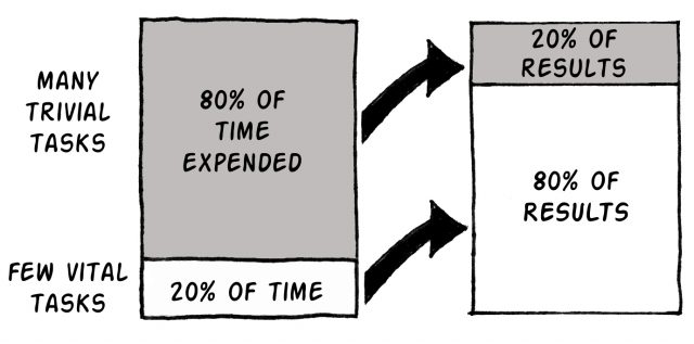
Essentially the 80:20 rule means that focusing on the vital few yields larger gains than the trivial many. The Pareto chart is a tool to focus attention on priorities while trying to make decisions. It is a good communication tool that
describes the data in a simple and easy-to-read bar diagram. The chart helps you to study and analyze the frequency or occurrences of an event in a process and identify the biggest contributors.
Why use a Pareto Chart Tableau?
There are many benefits of using a Pareto Charts in economic terms. A Pareto Chart:
- Breaks a big problem down into smaller pieces
- Identifies the most significant factors, shows where to focus efforts,
- Allows better use of limited resources.
We can separate the few main problems from the many likely problems for us to focus our improvement efforts, arrange data according to priority or importance, and determine which problems are most important using data, not perception or gut feeling.
A Pareto Chart can answer the following questions:
- What are the biggest issues facing our team or business?
- What 20% of sources are producing 80% of the problems?
- Where should we concentrate our works to produce the greatest advancements?
An Illustration of the Pareto Chart Template
Let’s have a look at an illustration of Pareto chart. The raw data can be seen in the first table. It has two columns which are defect type and count of defects.
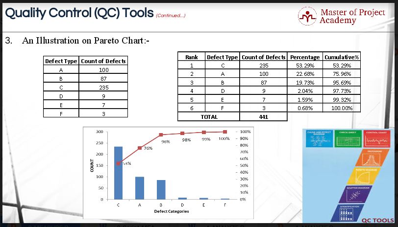
- The first step is to organize the raw data in a meaningful manner for us to draw the Pareto chart. The data has been arranged in descending order.
- Secondly, we have calculated the sum total of ‘Count of Defects’ column. In the ‘Percentage’ column, we have divided each observation in ‘Count of Defects’ column by the sum total of 441.
- We have divided 235 by 441 and multiplied the sum by 100 to calculate the percentage contribution of 53.29% and so on.
- In the cumulative% column, we have calculated the cumulative percentages for each observation in ‘Percentage’ column. The figure of 53.29% has been copied and pasted in ‘Cumulative%’ column to begin the calculation.
- Then; the figure of 53.29% has been added to 22.68% to arrive at the cumulative% of 75.96%. The calculation should continue until we reach the last column.
- With this, our data is said to be organized in the manner for us to plot the Pareto chart.
In this example, defect types C and A accounts for nearly 80% of the problems. The Six Sigma project team should focus on these defect types to improve the process.
Plotting a Pareto Chart
For plotting the Pareto Chart, we can make use of three columns: Defect Type, Count of Defects and Cumulative Percentage. We can easily plot the Pareto Chart now. Please have a look at the Pareto Chart in the figure above. The graph will answer your question as to which are those 20% defect types contributing 80% to the business problem under consideration. Since the example was fictitious, we do not know what exactly the practical reason or business problem was behind plotting Pareto Chart.
How to construct a Pareto Chart?
We have already gone through an illustration of Pareto Chart and it must have helped us understand the process of constructing it. However, for the sake of readers and subject-matter enthusiast who are new to this topic, let’s go through the process of constructing the chart.
Step 1
The first step is to determine the classification for the graph. If the desired information does not exist, then obtain it by designing check sheets and log sheets
Step 2
The second step is to select a time interval for analysis. The interval should be long enough to be representative of typical performance.
Step 3
The third step is to determine the total occurrences, for instance, Cost, Defect Counts, etc. for each category and to determine the grand total. If there are several categories that account for only a small part of the total, then group those into a category called ‘‘Other.’’
Step 4
The fourth step is to compute the percentage for each category by dividing the category total by the grand total and multiplying by 100.
Step 5
The fifth step is to rank-order the categories from the largest total occurrences to the smallest.
Step 6
The sixth step is to compute the ‘‘Cumulative Percentage’’ by adding the percentage for each category to that of any preceding categories.
Step 7
The seventh step is to construct a chart with the left vertical axis scaled from 0 to at least the grand total. Put an appropriate label on the axis. Scale the right vertical axis from 0 to 100%, with 100% on the right side being the same height as the grand total on the left side.
Step 8
The eighth step is to label the horizontal axis with the category names. The left-most category should be the largest, second largest next, and so on.
Step 9
The ninth step is to draw in bars representing the amount of each category. The height of the bar is determined by the left vertical axis.
Step 10
The tenth step is to draw a line that shows the cumulative percentage column of the Pareto analysis table. The cumulative percentage line is determined by the right vertical axis
And there you have it! Ten easy steps to create a Pareto Chart to see which 20% of factors creates 80% of problems in your Six Sigma project.